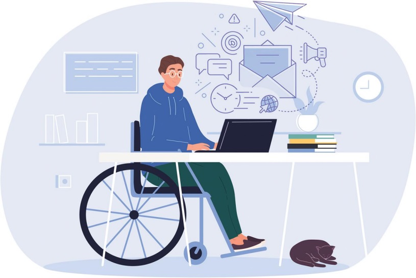
MAKING EMAILS ACCESSIBLE TO USERS OF ASSISTIVE TECHNOLOGY
COURTESY OF MONTCLAIR STATE UNIVERSITY
Making emails accessible helps to ensure those using assistive technologies such as screen readers can understand what is being communicated.
Sandy Deane, Digital Communications Director in the Department of University Communications and Marketing at Montclair State University, explained how taking simple steps to make online communication more accessible can make a big difference.
"Making digital content accessible for all is a small effort that has enormous impact on those who rely on adaptive technology. True inclusivity cannot occur without prioritizing digital accessibility."
Keep these best practices in mind to make emails more accessible:
- The content of an email must be text within the body of the email. Do not use an image in place of text (e.g. an image of a printed flyer or invitation) or attach the content as a Word Document or PDF.
- Avoid special or custom fonts in your emails since the reader's device may not have those fonts installed. Stick to basic font categories and ensure that text is large enough to read and that it has sufficient contrast with the background color. You can verify that your text has sufficient contrast using the WebAIM Contrast Checker.

- Maintain a logical reading order so that a screen reader can read the content effectively. Since a significant portion of the recipients will be viewing their email on a mobile device, it is best practice to design your emails with a single-column layout.
- Write a clear, concise subject line that accurately describes the contents. Remember that the email reader will usually only show the first few words of your subject, so do not put the important part at the end of the line. For example, instead of "Montclair State University introduces ground-breaking new program in Sustainability Science," consider rewriting it to something like "New Sustainability Science Program at MSU."
- If your email covers multiple topics – like in a newsletter – break the body of the email into multiple sections and identify those sections with large, clear headers. This would allow the recipients to get the gist of a multi-part email just by scrolling.
- If the email includes pictures or graphs, please include alternative text or descriptions.
- Use descriptive links that make it clear where the link will take the reader and avoid links like "click here" and "read more" whenever possible. Try to avoid putting too many links in close proximity because it increases the likelihood that a user with a small touch-screen device will tap on the wrong link by mistake. Additionally, paragraphs with too many links gives the user nowhere to "grip" the page while scrolling, without running the risk of accidentally tapping on a link. •